7 Deadly Sins of PowerPoint
Latest Posts
- 2024 Reading List for Leaders
(posted: 07/01/2024)The right book can be a leadership game-changer.
- Coach's Notebook: Exec Presence for Leaders
(posted: 05/08/2024)As a leader your charisma is critical. Learn how to develop it!
- New Year's Resolutions vs New Chapters
(posted: 02/01/2024)Forget New Year's...Your new chapter can begin when you are ready!
Blog Archives
Kristi posts to her site about once a month, but frequently more often. She also appears as a featured contributer on select other sites. If you would like to be notified when new blogs are posted, please subscribe to our newsletter.
If you are interested in Kristi guest posting to your site feel free to contact us.
7 Deadly Sins of PowerPoint
(posted: April 25th, 2017)
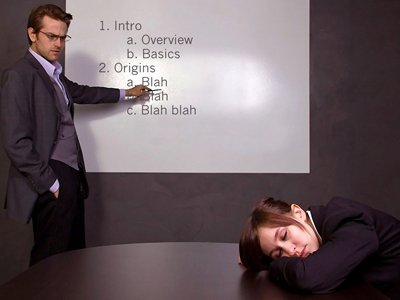
 It's been estimated that 350 PowerPoint presentations are given every second around the world, and I'd guess that most of them are boring. You've heard the phrase "death by PowerPoint"?
Have you seen PowerPoint used effectively?
What about the reverse: How have you seen PowerPoint stifle a presentation? How does it get in the way?
Your slides, if you choose to use them, should not be the focus of your talk. As many of you have heard me say, you deliver the message, you are the message!
It's common for people to cringe at the mention of PowerPoint, as though the software is to blame for boring presentations. Switching to Prezi or Slideshare or another PowerPoint alternative doesn't fix the common problems with slide decks, though. PowerPoint is a tool, it's not the content, and it doesn't tell engaging (or boring) stories. The presenter does. You do.
If you fill your slide deck with poor design and confusing content, your talk is doomed to be relegated to the status of "death by PowerPoint." If you take the time to learn some basic concepts and design your slide deck well, people won't even realize it's PowerPoint.
To help you craft a better PowerPoint presentation and make your next talk more effective, here is my list of the seven deadly sins of PowerPoint.
7 Deadly Sins of PowerPoint
Sin #1) Clip Art / Bad Art / NO art
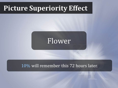
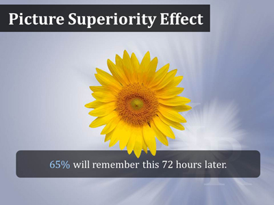
Expressions like, "seeing is believing" or "a picture is worth a thousand words" are used throughout human civilization, but why? It turns out that we humans learn better and recall information faster when it is presented as pictures. It's been studied a lot and is called the Picture Superiority Effect.
In one experiment, people who were given information orally or in writing remembered about 10% of it 72 hours later.

People who got the information in picture form were able to recall 65% of it in 72 hours.

So clearly, imagery is critical to getting your message across, but that doesn't mean that you should use that little man who comes with Microsoft Office! Your visuals need to help your audience understand your points, or perhaps set the stage or create a mood, and Clip Art doesn't do that. Just using it to take up space and to include "some" art is going to confuse your audience. Similarly, use stock photography carefully. It's great to have people in your presentation as they add humanity and give your audience someone to relate to, but it's also easy to end up with obviously posed, stereotypical shots of people in poorly fitting business suits that everyone has seen before.
Whatever you do, don't simply Google the image you want and use the first thing you find! Copyright is a real issue. You don't have to use Getty Images, but there are low-cost and even free options. A stock photo site, 123RF is quite reasonably priced. Images on Wikimedia Commons are all either in the public domain or licensed for reuse through Creative Commons. If you are willing to work a little harder, you can also find CC licensed images on Flickr. There are some other options out there for free photos including Death to the Stock Photo, Pixabay and Unsplash.
If you don't have the time or the patience to search out just the right image for each slide, and many people don't, consider hiring a professional.
Sin #2) Small Fonts
Fonts on slides need to be bigger than most people realize. Unless you are creating what Nancy Duarte calls a "slidedoc", meant to be viewed by a single person on their own device (or in print), you need to make your written content legible in the back row. Design for the 75-year-old in the back of the room, not the 25-year-old at the front. It's hard to lay down a specific rule because visibility is dependent on the conditions of your presentation. In a small room, smaller fonts are less of an issue. In a large auditorium with many rows of seats, you'll have to go bigger. Then again, on truly huge conference or event screens (40 feet by 20 feet), larger font sizes can actually end up feeling overwhelming. That said, if you choose a san serif font for the body text and never go below 32pt you should be safe. Headers should always be bigger.
Sin #3) Slide Show = Teleprompter
When my clients first come to me they are often using their slides as their speaking notes, and they fear that without detailed slides they won't know what to say. But slides are for the audience, to help them to absorb and remember your information, not you. The best option is to memorize your talk, but not everyone has the time or the patience for that. Instead, use the notes section of Power Point, or print your notes out on paper or notecards and keep them where you can glance at them.
According to Think Outside the Slide, 72% of people hate it when presenters read their slides.
Sin #4) Too Many Words
We've all been to these presentations. The speaker's slides are filled with content and they are rushing through it, reading it all right off the slides (see Sin #3). Most of the audience is squinting at the screen trying to read the content (and not listening), while the more visual learners are left in the dust. People can't process multiple sources at once, so they'll either listen to you or read your slides.
I like to remind people to put only one thought or point on a slide, and avoid bulleted lists. If you really can't get around using a list on screen, break it across multiple slides, and consider a very simple animation so you can address one point at a time. Even for data-heavy talks you can find ways to make the information less overwhelming. If you are comfortable with your subject, consider not putting ANY text on some of your slides, just an image or graphic.
Sin #5) No Handout
How is this a Power Point sin? While there are many good reasons to provide a separate handout to your audience, in this case it is the perfect way to give attendees all the important data, (charts, graphs and statistics) that you removed from your slides--you have removed them, haven't you?
Depending on how you have planned your talk, and how interactive you intend to be, you might want to pass these out to people afterwards so that they aren't distracted during your presentation. On the other hand, if the audience is set up to take notes and your handout clearly gives them that opportunity, make sure they have it during your talk.
Handouts are not effective when they are simply the printed version of your slide deck!
48% of audience members find the text on slides too small.
~Think Outside the Slide
Sin #6) Animations, Just Because You Can
Creativity and originality are good, and we want our slide shows to be engaging, but making your text spin, grow, and shrink, or making your little Clip Art guy shimmy, just tells your audience you know how to access the animation panel in PowerPoint. In some cases a very simple animation can be effective, for example to highlight one bullet at a time--but you are getting rid of your bullets, aren't you? There are times when a cool visual effect actually does make sense. But mostly animations annoy and distract the audience. Did Steve Jobs, one of the most engaging presenters ever, use animations? No. He focused on his content and his presence to captivate the audience. General rule of thumb: Avoid animations in your presentations.
Sin #7) Pre-Installed Templates
It's incredibly obvious when you use one of the templates that comes with PowerPoint. Especially if you then use Calibri or Times New Roman, the default fonts. Use the templates and defaults and you will look unprofessional. Just a background color with a non-default font can be simple, yet elegant. While you're at it remember that contrast is important, too. If you put light green text on white, or white text on yellow, or red on blue, you're going to end up with a mess. Black on white is the best contrast you can get, if a bit boring. White on a dark color (black, charcoal, dark blue) is a bit more dramatic and still offers great contrast.
Death by PowerPoint is not the software's fault! Keep your presentation simple, and powerful. Remember that ultimately, YOU are the message. The slides are meant to support you and your message, not become the focus of the presentation. And, of course, we are here to help. Contact us if you'd like to work on your presentation skills!
- Which of the 7 Sins are you guilty of?
- What presentation "sin" would you add to this list?
- Which one of the 7 Sins came as a surprises to you?
Sign Up for our monthly newsletter and never miss another post.
Images licensed from 123RF
